for 3 months.
That's funny.
for 3 months.
Those like DH are afraid of many things, keeping track of a piece of paper now added to the long extensive list.Or, get your vaccine when it’s your turn, and stop complaining about stupid little things like a card.
We have a world wide depression and a pandemic with over a million and a half people dead, and you’re worried that you might have to carry a piece of paper for 3 months.
Not afraid.Those like DH are afraid of many things, keeping track of a piece of paper now added to the long extensive list.

Agree with your Dad4 comment, but disagree with you vaccine position.I am wondering why I should take a vaccine when my risk factor is minimal.
And as I look at my kids it is NON EXISTENT.
You on the other hand seem to like every rule put out by government and willingly follow along.
Agree with your Dad4 comment, but disagree with you vaccine position.
Amongst all the arbitrary, window dressing, non-science based and purely political restrictions and rules, getting a vaccination is something that would substantively mitigate the pandemic. When my turn comes I will get a vaccine. Although there is precedent for doing so, I'm not sure how comfortable I would be with the government mandating it, but I have no problem with schools, airlines, or any other organization requiring it as a condition of participation.
Nate is a data guy, and the CA rules are largely skew to the actual data. He wasn’t going to be in favor of the current form of the rules.
Angry parents won’t let officials slide over closed playgrounds, packed malls
For many parents confounded by an array of official dictates, closing playgrounds crossed a line in the sandbox.www.latimes.com
They've even lost Nate Silver
I likely missed your post regarding mRNA. Can you explain your concerns again.I have concerns about the mRNA vaccines. They may be fine but I'd like to wait...would take the traditional vaccines in a heartbeat but those would be available later. Without more data, doubt I'd let my kid take the mRNA one.
I likely missed your post regarding mRNA. Can you explain your concerns again.
Maybe by the time the kids' turn comes there will be better options or more data. One of my concerns with kids being last is that Newsom will use that as an excuse to not allow in-person school and youth sports until kids are vaccinated which could be well into the next school year. My daughter will be a senior next year and if he F$%#s in any way with her senior year, I'm not sure what I will do. For sure I will be a tall dog on our district. I feel really sorry for HS Seniors from last year and this year.
I would assume that, by the time kids are allowed to get a covid vaccine, there will be some traditional vaccines on the market.The technique is new (which is why they were able to deploy first). Long term effects have not been therefore studied. It's probably o.k. Probably is o.k. for me (my life is probably 1/2 over) not o.k. for my kid who is at no risk for this thing. I know some medical professionals too which have expressed the same view....not I won't ever take it....but I need to read and to hear more.
Funny part is they must of been smoking crack when they voted. One of my tenants tried to pull that on me...claim that the no smoking clause in the lease means cigarette smoking and doesn't apply to pot. I probably would have lost in court in California had he not voluntarily complied.This sounds like the way a lot of places come up with covid policies.
"The San Francisco Board of Supervisors voted Tuesday to ban smoking in apartment buildings—but made an exception for marijuana, the San Francisco Chronicle reported. "
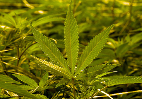
San Francisco Bans Smoking Tobacco in Apartments—but Allows Weed
The San Francisco Board of Supervisors voted Tuesday to ban smoking in apartment buildings—but made an exception for marijuana, the San Francisco Chronicle reported.freebeacon.com
Be careful where you fart

Can farts spread COVID-19? This Australian researcher claims so! - Times of India
If you thought farts could just stink, think again. A new body of research suggests that farts might be the newest form of transmission to spread thetimesofindia.indiatimes.com
So you are only concerned about yourself personally? That kind of thinking is why we are where we are.Not afraid.
I for one however like the concept of freedom and choice. And when one looks at the data and who is at risk the choice is even clearer.
If you are scared, by all means get the vaccine.
If as they say the vaccines are 90-94% effective, have the people actually at risk take the vaccine if they want it.
"I don't dance, I make money moves"Strip clubs are not dance establishments. They are bars which happen to have naked women exercising their first amendment right to free speech.
I agree that strips clubs should be closed, but you can’t do that without also closing the rest of the bars.
If the strip clubs are open but banned from serving food and drink, then it gets more interesting.
No...I’m more worried about things like this that are becoming more and more common:So you are only concerned about yourself personally? That kind of thinking is why we are where we are.
Medicated constituents are pliable.This sounds like the way a lot of places come up with covid policies.
"The San Francisco Board of Supervisors voted Tuesday to ban smoking in apartment buildings—but made an exception for marijuana, the San Francisco Chronicle reported. "

San Francisco Bans Smoking Tobacco in Apartments—but Allows Weed
The San Francisco Board of Supervisors voted Tuesday to ban smoking in apartment buildings—but made an exception for marijuana, the San Francisco Chronicle reported.freebeacon.com
Really? Look around the world amigo.So you are only concerned about yourself personally? That kind of thinking is why we are where we are.
